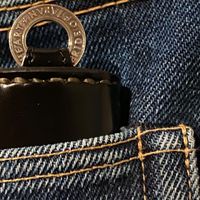
GOOD ART HLYWD - A Gallery
-
@Daniel-San said in GOOD ART HLYWD - A Gallery:
@Oaktavia
would like to see more of your bracelet mate


This one? I always have it on!
-
@Oaktavia
yes , absolutely dig it !
looks like it’s even a little wider than the Model 10 in B .
thx mate ! -
Josh has change. The style on model 10 version 3 look smart and thinner
Previous version 2 links are like that.
Bulky -
@Kasi
ah ok , thx Mo ! -
@Kasi said in GOOD ART HLYWD - A Gallery:
Josh has change. The style on model 10 version 3 look smart and thinner
Previous version 2 links are like that.
BulkyOh neat, I was unaware, thanks for the info. It is pretty bulky and took time to get used to it. Defo feel naked without it on now.
-
-
@Kasi what are the pros/cons you’ve experienced between the two versions? Was it merely an aesthetic change, or did GAH seek some added functionality with v. 3?
-
@motojobobo said in GOOD ART HLYWD - A Gallery:
@Kasi what are the pros/cons you’ve experienced between the two versions? Was it merely an aesthetic change, or did GAH seek some added functionality with v. 3?
Primarily anti counterfeiting measures, and I guess they decided to rebrand slightly too, away from gothic font to the GOOD ART, as well as removing the Hollywood part of their brand, which is also appears to be a deliberate change
-
@Alex thanks for that explanation!
Hmmm…I guess that makes my BLB and St. Christopher keychain outdated versions. Feels like the rabbit hole is growing ever-deeper and wider. -
@Kasi
great informations Mo , thank you !!
did they change the b&t bracelet too ? -
 wow @Kasi
for you ?


